


It is now Tuesday at 7:53pm. I am due to publish a new piece on Wednesday morning and I’m currently looking at a blank page. Yes, this is a fake deadline because this is a free newsletter that I write for fun, but I take it seriously!
I’m thinking I should do what comes most naturally - hate.
As someone who works in e-commerce, I am quite familiar with the minutiae of the online journey. So when I shop in my spare time and see one of these things, it makes my blood boil. These are my icks - things that won’t make me file a report with the Better Business Bureau, but will make me think twice about shopping again. Let’s dive in.
Premature asks for product reviews
There’s nothing worse than getting one of these emails before your product has even arrived. I’d love to tell you what I think about my order, but unfortunately it’s still in a distribution center in Pennsylvania!
All this does is make it very obvious when a brand has slow shipping.
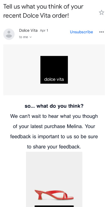
Dolce Vita wasn’t really an offender here, though they sent me this just ~1 week after my shoes arrived. Since these were heels, I hadn’t worn them yet - I’m normally a sneakers girl. Brands should play around with the triggers for these emails as some of the best reviews come after the customer has really gotten to know and use the product.
Popups that are hard to click out of
Nothing will make me bounce faster than one of those “Enter your email for 15% off” popups that takes up the entire screen on mobile and is impossible to exit.
Cuts Clothing is unfortunately an offender. While they have a visible “X,” it falls so close to edge of my phone screen that I can barely click it. The timing of this popup is almost immediately on page load, so I can’t even tell if I like the product before I’m asked for my information.

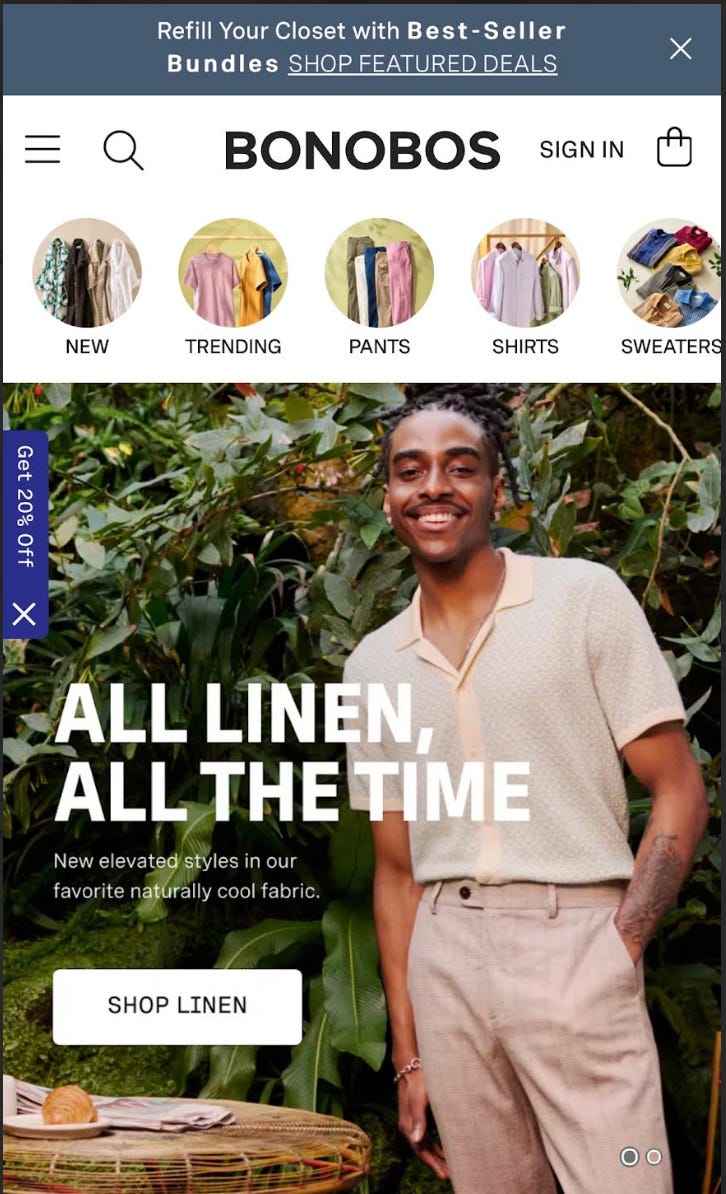
I have started to see brands backing away from these invasive popups, especially as >70% of sessions are on mobile (clicking out of these on a phone is more annoying than on a desktop). Bonobos has their sign-up offer nested and in the top rotating banner - very visible, but not as disruptive.
and a related ick…
Popups that ask for too much information
First brands wanted my email. For 20% off, okay, it’s a fair trade. Next they wanted my phone number. And the table stakes offer has moved down to 15% off. Now, they’re asking additional survey questions, too.

What will be next? Will they want me to donate a kidney for 10% off?
I fully understand the value of this data for brands - the ability to reach customers directly is invaluable. And brands are investing in first party data for many good reasons.
But asking for all of this up front is too much - as new visitors to a site, we haven’t had a chance to become interested in what a brand is offering yet.
In this example, Lizzie Fortunato is one of my favorite jewelry brands. If SMS signup were positioned as a loyalty initiative in a post-purchase email, I likely would sign up for texts. Alternatively, if I’d browsed for awhile and then saw this offer in a PLP tout, I might sign up. I’ve also seen many brands tie Free Shipping offers to email and/or text sign up - this feels like a fair exchange.
Product pages that don’t make it easy to buy the model’s entire outfit
Sezane styled this chic, Parisian trench coat with pieces that seems to be available on the website. But these items aren’t made shop-able anywhere on the page. This is a huge missed opportunity, and so annoying for shoppers!

Tuckernuck, on the other hand, does a great job showcasing the shop-able look and making it easy to see more details on any of the items without leaving the page. Bravo!

Too much packaging
The conventional wisdom in the e-commerce world is that having a fancy “unboxing experience” is a special moment for customers to get to know a brand. This might be controversial - but skip the packaging, and just give me what I ordered!

When I open the box and see all this stuff, I feel wasteful. I also think that the brand’s margins are too high, and that they should lower the price by a few dollars instead!
One brand whose packaging I love is Ghia. It is beautiful, but functional. While they include printed collateral, it has a clear purpose - recipes to educate customers on the product and how to use it. Packaging with a purpose is fine in my book.

Aggressively high shipping minimums
More brands are charging for shipping as fulfillment costs continue to rise. At the same time, my ick is shared by the masses - high delivery costs is the top-cited frustration among shoppers worldwide, according to eMarketer.
I’m all for brands who want to protect their margins on small orders. I don’t expect brands to pay $10 to ship me a $20 item. But some of these shipping minimums feel like highway robbery.
Rachel Antonoff has a $300 minimum on her site, despite having an average unit price in the ~$150-200 range. I believe that a customer purchasing a single item at that price should have the shipping comped by the brand. In this case, I would advise the brand to raise prices slightly to compensate for shipping costs.

What is your biggest e-commerce ick? Do you agree with these? Let me know!
Stay Curious,
Melina
Pop ups on every landing* page. Do those work? I don’t need a sale yet I didn’t even see anything. It seems so needy
Slow loading (J Crew is the worst)
Too many photos on landing
I wish stores had simple sites just show me the products in a 9x9
This was so fun! I’ll add that my ick, now that I write a free newsletter too, is brands who don’t include a clean flat lay photo on their PDP. Let me promote your items for you!!