


Mapping the modern shopping journey
Why e-commerce isn't one-size-fits-all

After a super hectic week at work and with my move (mostly) complete, I have my head above water again - and I’m so excited to dive back into writing Curious Commerce!
I spend my days optimizing how we shop for beauty products online. Yet when I am shopping online myself, it often feels like a chore. In the e-commerce world, we use words like “discovery” and “inspiration” - but clicking through filters, popups, and product variants to buy something feels more like drudgery. I love writing Curious Commerce because it lets me explore how we can make shopping online fun. Today, I’m going to break down the key parts of the e-commerce shopping journey and share some of my favorite examples of brands and retailers who are doing it right.

Shopping Journeys: No one-size-fits-all
When imagining the typical online shopping journey, you may picture a very linear experience: a customer goes to a Brand’s homepage, clicks to the category they want to shop, views a few product options in this category, adds to bag, and checks out. In reality, this is just one of many paths a customer might take.
I’ll summarize a few of the common paths here:

Common for new shoppers
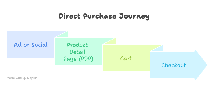
Common for direct traffic - typing a brand’s URL into the browser
Often involves filtering in category pages and using the navigation
Increasingly popular with paid acquisition and influencer campaigns.
Stronger intent; often mobile-driven.
Conversion can be high - especially for lower-priced (impulse) products
PDP content is critical - ratings and reviews, UGC, and other “proof” that product is legit
Skips browsing in favor of direct purchase.
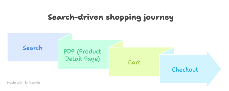
Reflects high-intent search behavior.
SEO and site search performance are key here.
Shopper may utilize PDP modules to view and compare alternatives

Retargeting or re-engagement flow.
Often for returning users or promotions.
These shopping journeys probably aren’t surprising to seasoned online shoppers like yourselves. We rarely sit down in front of our computer and say “it’s time for me to shop now” and type in a brand’s URL. Rather, shopping is integrated into our day-to-day, with an ad spurring an impulse purchase or a conversation with your spouse resulting in a quick Google search to replenish a household item.
Across all these journeys, we observe that some parts of the site are viewed more than others:
View frequency by type of e-commerce webpage

Why does this matter?
Across these journeys, customers expect to use different parts of the site in different ways. Sometimes, these expectations seem to conflict. Customers in the classic “browse first” path get to the product page after reading a lot about the brand on homepage. They want to make an “add to cart” decision quickly. Customers landing immediately on a product page from an Instagram ad may want to learn about the brand before deciding to add to cart - and the product page should also address this goal. Brands are constantly balancing these objectives. Here are a few insights from how customers are shopping today:
PDP is King
As the most-viewed page on most brand websites, balancing conversion-driving content to encourage exploration on the product detail page is critical.
J.Crew’s product pages do a great job balancing shopability and other objectives - like driving upsell/cross-sell.
A few things I like here that drive conversion
the prominence of the customer rating
the prominent Add to Bag button
the clearly messaged sales price
the model’s height and size called out
details like fabric composition are collapsed - this can be overwhelming on mobile, and may be more relevant to some shoppers than others
At the same time, this page is positioned to do more than just convert on this particular product
ability to “shop the look” with multiple styles shown - drives a bigger basket
relevant alternatives presented, so shopper will continue their journey vs. exiting
clear navigation in the header that leads to other cateogories
One thing I might invest more in for J.Crew, especially for hero products, is user-generated content. I’d love to see customer images in the clothes.
Custom landing pages are increasingly used to make shopping journeys more personalized
Shoppers may see a custom landing page when they click through the website from a paid ad or an email. This allows the brand to tailor content specifically to a certain customer segment (recipients of the email or ad) without altering the entire site. I’ve discussed in past newsletters how advances in AI will further automate the ability to create and manage lots of custom experiences, including landing pages. In the not-to-distant future, we could all be looking at our own unique version of a brand’s website.
A custom landing page just converted me yesterday. I saw a version of this very cute ad on Instagram.

When I clicked through, I landed on a page dedicated to NYC-focused baby gear from this brand. Adorable! Pages like this are easy to spin up and ensure that users who appreciate the ad are directed to relevant products upon click. However, the brand avoids cluttering their navigation with really niche pages.

Another way to customize is based on occasion. With the Coachella festival this weekend, lots of brands could curate an edit of festival-inspired styles and spin up a landing page to highlight these. They could then direct traffic here to take advantage of the moment.
Customers are bypassing the homepage
With better targeting and social commerce, shoppers increasingly bypass the homepage and landing on a category page or product page right away.
This means brands - especially lesser-known small brands - need to tell their story on these pages, in addition to the homepage. They must answer questions like “what does this brand stand for?” and “is this brand a good fit for me?”
Brightland, the olive oil brand, does a great job of integrating it’s story and benefits on the product page.
A few things I like:
Brand-building information, like details on their farms, is included in the product details (but collapsed so it’s not too much for a conversion-oriented shopper)
Inclusion of recipes and high-quality food images lend the product a feeling of quality and healthiness
As the lines blur between discovery, inspiration, and purchase, the brands that win will be the ones who meet shoppers wherever they are—whether that’s on a PDP, on TikTok Shop, or a Coachella-inspired landing page.
Online shopping doesn’t need to feel like a chore—and with the right strategy, it won’t. I’ll be back soon with more examples of brands who are reimagining the e-commerce experience, one step of the journey at a time.
If you loved this piece, share with a friend!
Stay Curious,
Melina
I resonated with a lot of this - especially about the notion of meeting consumers where they’re at on their journey instead of trying to force them into a box. At Locker where I work, we’re helping brands focus more on allowing customers to make decisions on their own time, and be able to retarget them when they’re ready. Instead of forcing an add-to-cart action, we’re encouraging shoppers to just save for later. As a result, any product saved can be easily found by not only you who saved it, but now anyone coming to Locker for a more fun and curated browsing experience :) Would love to tell you more for your future research if you’re ever interested!
Late to the party here but love this post and the examples you gave. A lot of times the conversation about improving shopping discovery with AI feels like too much of a leap from how we’re shopping today but the examples you explored here make a ton of sense for brands to already implement immediately.